After our audience feedback we changed the poster to fit the conventions more.
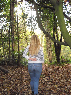
We edited the image so that there was more contrast and hue, this made a black edge around the image making the main protagonist the focal point. This edit was important because it stands out more and makes the whole poster look sharp and well put together. The font is changed because on the feedback we noticed a lot of people commented on how the font was too simple. We did a text that stands out and looks more like a 'thriller' font. We also added a tagline. This was something we missed out when putting the first together. When we were modifying the poster we realised this could add the realism value to the poster.


