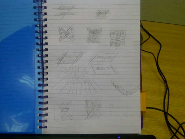
We were brainstorming about what our logo would look like. We came up with these different ideas, and thought that the one at the top looked the best and represented the wording the best. It is simple enough to recreate and looks good as a title.

We thought we would develop the logo, to make it look the best it could. We looked up 'parallel' on Google images and a lot of these drawing came up where there was two lines parallel to each other and a line going through it.
After drawing the first draft of it we wanted to make the line going through it more slanted.
 After doing that we thought it would look better if the line went in the different direction.

After drawing the first draft of it we wanted to make the line going through it more slanted.
We really like the way it looks now, with the italic writing and the lines going well together.
Next step was to develop it even further, making it bigger and scanning it onto the computer so that we could tweak it in anyway.
No comments:
Post a Comment